


More details
How can graphic design convey reconstruction and the rewriting of truths, using fragmented typography and the “X” to reveal, conceal, and question the narratives of “the others”?
The Others project builds a bold, minimalist identity infused with human tension and mystery. Its fragmented typography feels reconstructed, like an anonymous letter or investigation board, reflecting the idea that “it’s always the others.” The misty background reinforces the sense of uncertainty, where truth and perception blur. The repetition of the “X” becomes a central clue — symbolizing both separation and encounter, but also marking the unknown figure, the one being sought yet never revealed. Through the contrast of red and white and the raw, handwritten textures, the design captures the fragile psychology of suspicion, identity, and human connection.
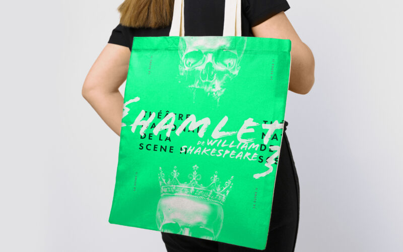
Scene II
Surface explores architectural duality through a bold red and white palette and a minimalist logo. Its 3D illusion balances flatness and volume, crafting a sleek, modern identity for the exhibition’s visual world. The graphic identity of...
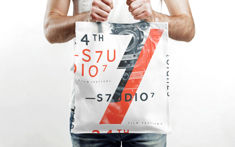
S7UDIO 7
How does S7UDIO 7’s graphic design embody the essence of cinema through typography and color? The bold use of the number 7 and energetic palette highlights creativity and cinematic power. The visual identity of S7UDIO 7, a film festival,...
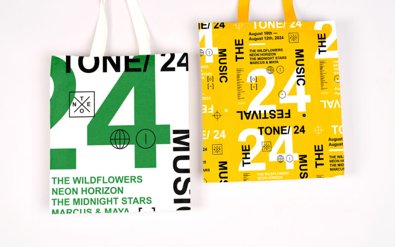
Tone
How can graphic design capture youthful energy and spontaneity for a music festival? TONE 24 uses bright colors and dynamic typography, creating a playful, DIY aesthetic that celebrates rhythm and community. The visual identity of TONE 24,...
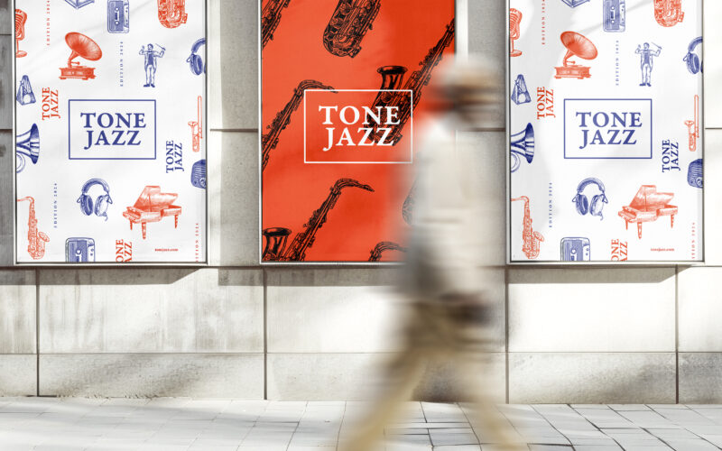
Tone Jazz
How does graphic design balance tradition and modernity for a jazz festival? TONE JAZZ uses orange and blue with intricate musician engravings, blending vintage charm and contemporary clarity in a cohesive visual identity. The visual...