


More details
How can a website visually echo the universal language of music? The challenge: create a modular, adaptive design that feels rhythmic, immersive, and responsive—like music itself.
The TONE website is a digital space dedicated to all forms of music, with a graphic identity that mirrors rhythm and fluidity. Built on a modular square-based grid, its design adapts like a musical composition. The black-and-white base is illuminated by blue, evoking a nocturnal, moody atmosphere. Transparent layers and overlapping elements create a sense of movement and depth—like shifting rhythms. Triangular shapes hint at playback icons, subtly referencing the act of listening. The layout’s flexibility, layering, and geometric logic generate a dancing visual structure that resonates with the beat of the music it celebrates—fluid, structured, and full of energy.
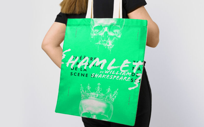
Scene II
Surface explores architectural duality through a bold red and white palette and a minimalist logo. Its 3D illusion balances flatness and volume, crafting a sleek, modern identity for the exhibition’s visual world. The graphic identity of...
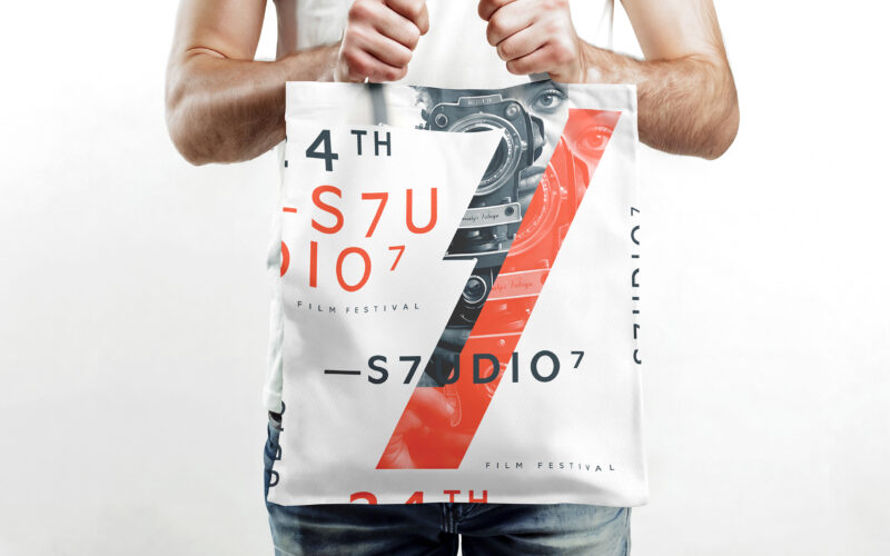
S7UDIO 7
How does S7UDIO 7’s graphic design embody the essence of cinema through typography and color? The bold use of the number 7 and energetic palette highlights creativity and cinematic power. The visual identity of S7UDIO 7, a film festival,...
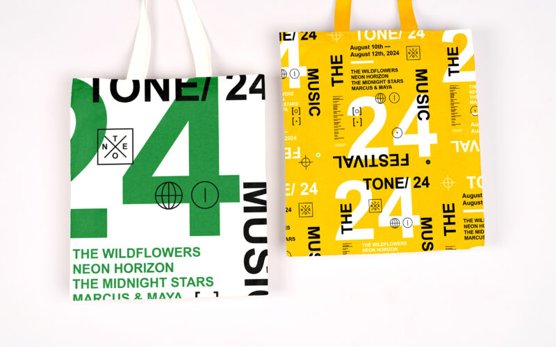
Tone
How can graphic design capture youthful energy and spontaneity for a music festival? TONE 24 uses bright colors and dynamic typography, creating a playful, DIY aesthetic that celebrates rhythm and community. The visual identity of TONE 24,...
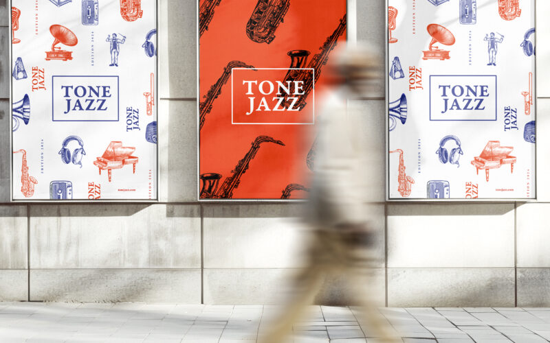
Tone Jazz
How does graphic design balance tradition and modernity for a jazz festival? TONE JAZZ uses orange and blue with intricate musician engravings, blending vintage charm and contemporary clarity in a cohesive visual identity. The visual...