


More details
How can graphic design challenge conventions while preserving clarity? Whois magazine uses black-and-white contrasts and subtle distortions, turning its logo into a visual riddle that provokes curiosity and questions identity.
The graphic design of Whois magazine, a publication focused on minorities and singularities, uses a predominantly black and white color palette. The layout follows a classic column structure but subtly distorts it, suggesting a challenge to conventional norms. The logo “Whois” on the cover is placed inside a solid circle, resembling a no-entry traffic sign, partially censoring the visual beneath. This bold graphic choice transforms the title into a riddle — “Who is?” — sparking curiosity. The magazine’s design plays with codes, hinting at disruption while maintaining readability, aligning with its mission to question, reveal, and provoke.
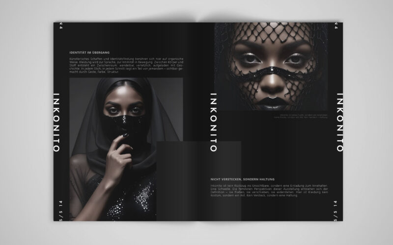
Inkonito
How can visual design affirm a modest, deliberate identity — using fashion and the metaphor of the mask not to hide, but to reveal the self with elegance, distance, and quiet power?INKONITO is a conceptual brochure exploring identity...
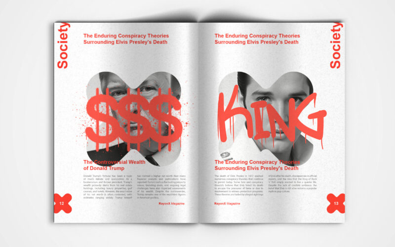
X-Ray
X-Ray magazine uses bold design and the X motif to decode society's layers. But can visual aesthetics alone effectively unveil the hidden complexities shaping modern culture and public discourse? This is a visually striking society...
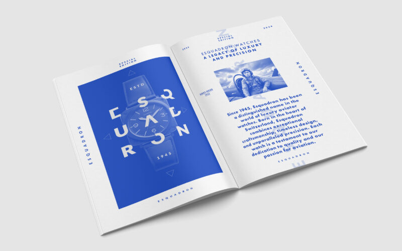
Escadron
How can editorial design elevate a luxury watch brand’s aviation heritage? Esquadron translates precision, adventure, and identity into visuals that echo cockpit geometry and evoke sky-bound elegance and technical mastery. Esquadron is a...
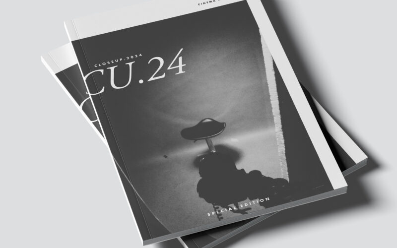
Close Up
CU.24 plays with contrast, framing, and cinematic rhythm. The challenge: how can graphic design capture the depth of film language—light, shadow, and emotion—through purely static composition? The CU.24 brochure embodies cinematic...