


More details
How can editorial design embody architectural thinking? AREA Magazine’s brochure uses layered, intersecting forms and unexpected imagery to mirror the structural logic and creative spontaneity that define the built environment.
The graphic design of the AREA Magazine brochure adopts a bold corporate aesthetic, using pale pink and deep violet—colors that break away from traditional architectural tones. The layout features interwoven, intersecting forms that create a modular, dynamic structure. Architectural visuals emerge unpredictably through the overlaps, evoking a sense of discovery. These intersecting layers suggest abstract stone assemblies or masonry patterns, reinforcing the material and structural essence of architecture. The design blends order with spontaneity, echoing the creative process of architectural composition. AREA Magazine thus becomes both a visual object and a conceptual space, where form and content are intricately intertwined.
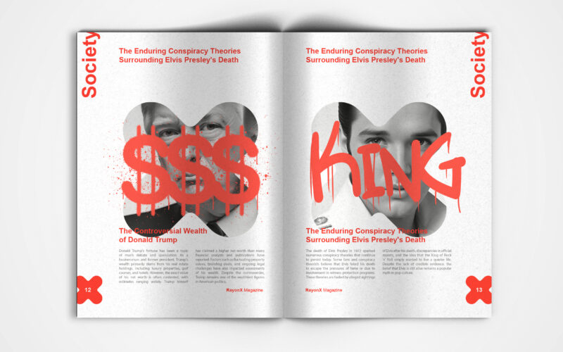
X-Ray
X-Ray magazine uses bold design and the X motif to decode society's layers. But can visual aesthetics alone effectively unveil the hidden complexities shaping modern culture and public discourse? This is a visually striking society...
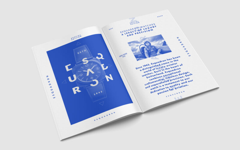
Escadron
How can editorial design elevate a luxury watch brand’s aviation heritage? Esquadron translates precision, adventure, and identity into visuals that echo cockpit geometry and evoke sky-bound elegance and technical mastery. Esquadron is a...
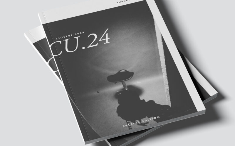
Close Up
CU.24 plays with contrast, framing, and cinematic rhythm. The challenge: how can graphic design capture the depth of film language—light, shadow, and emotion—through purely static composition? The CU.24 brochure embodies cinematic...
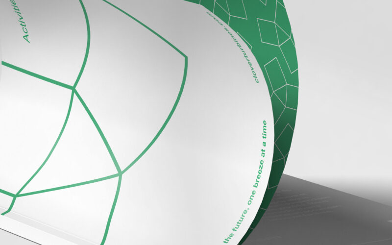
Clover
How can Clover’s magazine graphic design balance minimalist Swiss modernism with ecological symbolism, integrating the helix logo to reflect clean energy and sustainability while maintaining elegance and clarity? The magazine for Clover, a...