


More details
How can design make task management fun and personal? KIM’s lively yellow and black palette, with handwritten scribbles and highlights, creates an energetic identity that inspires creativity, joy, and organization.
The graphic design for KIM (Keep In Mind), a to-do and agenda-style app, embraces a handmade, playful aesthetic. Dominated by dynamic yellow and black tones, the visual identity captures the spontaneity of notes jotted in physical planners. The design features scribbles, highlights, circles, and pins—just like a memory scrapbook. Applied to stationery, mugs, tote bags, and t-shirts, the brand radiates energy and optimism. KIM transforms task management into a cheerful ritual, making users feel organized and inspired. The tone is casual yet clever, appealing to those who value creativity, joy, and a human touch in their daily planning experience.
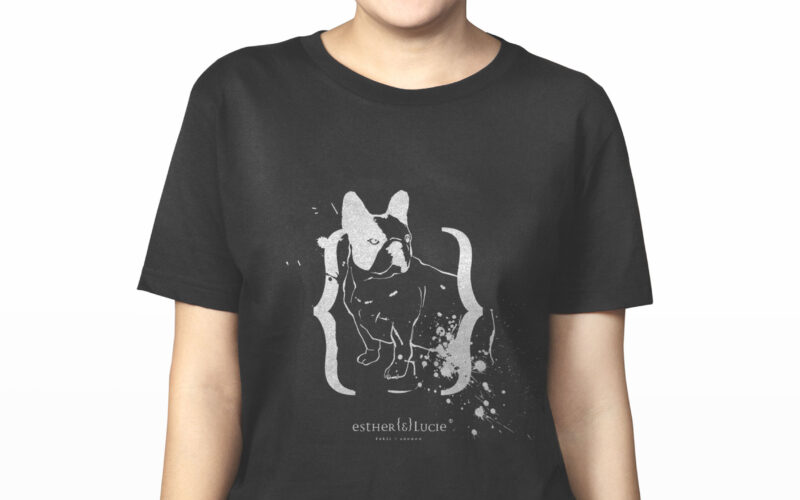
Esther & Lucie
How can a cosmetics brand embody individuality, irreverence, and friendship through design? Esther {&} Lucie merges personal storytelling, punk-inspired ink marks, and hand-drawn portraits into a playful, rebellious visual identity....
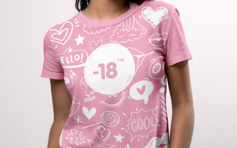
-18
How can a visual identity empower teenage girls through design? “-18” turns diary scribbles, irony, and soft tones into a playful code, creating a youthful, exclusive world that joyfully excludes adults. The graphic design for the brand...
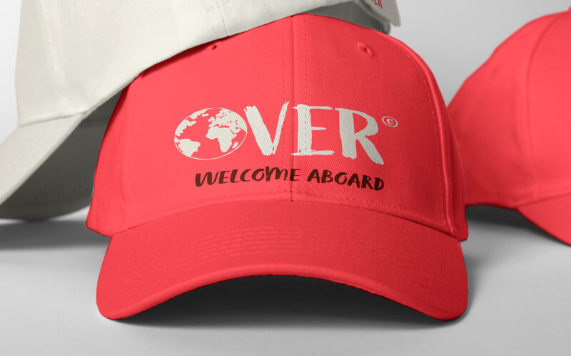
Over
How can Over’s graphic design express the spirit of authentic, joyful exploration through a warm, personal, and vibrant visual language that breaks from conventional travel norms? The graphic design for Over, a travel agency, captures a...
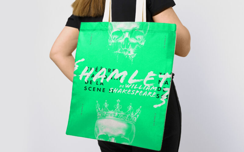
Scene II
Surface explores architectural duality through a bold red and white palette and a minimalist logo. Its 3D illusion balances flatness and volume, crafting a sleek, modern identity for the exhibition’s visual world. The graphic identity of...