


More details
How can Over’s graphic design express the spirit of authentic, joyful exploration through a warm, personal, and vibrant visual language that breaks from conventional travel norms?
The graphic design for Over, a travel agency, captures a free-spirited and adventurous identity. Featured on the presentation website, posters, badges, bags, and caps, the design uses a vibrant pink and soft beige color palette that feels both lively and warm. A handwritten-style typeface brings a personal, joyful, and human touch to the brand, evoking a sense of spontaneity and authentic exploration. Far from traditional, organized tourism, the visual identity reflects a globetrotter mindset—independent, curious, and connected to the world. The overall style feels rooted, emotional, and crafted for those who travel to truly experience, not just to visit.
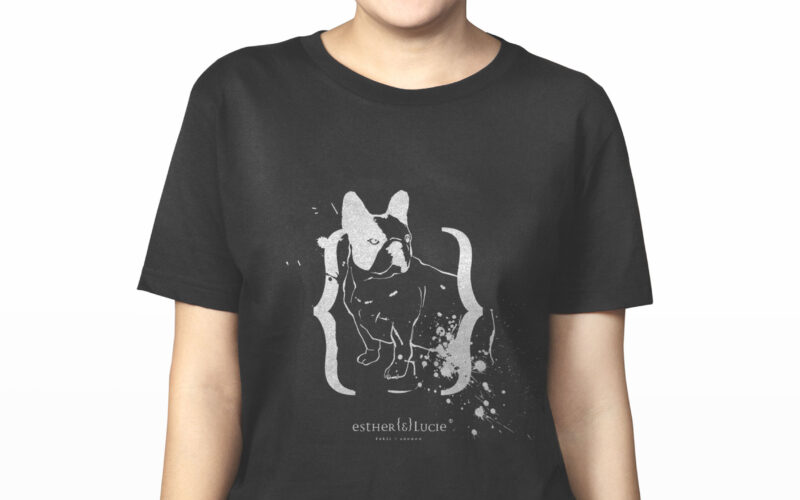
Esther & Lucie
How can a cosmetics brand embody individuality, irreverence, and friendship through design? Esther {&} Lucie merges personal storytelling, punk-inspired ink marks, and hand-drawn portraits into a playful, rebellious visual identity....
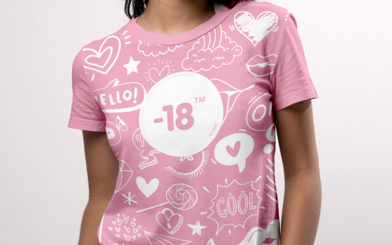
-18
How can a visual identity empower teenage girls through design? “-18” turns diary scribbles, irony, and soft tones into a playful code, creating a youthful, exclusive world that joyfully excludes adults. The graphic design for the brand...
Scene II
Surface explores architectural duality through a bold red and white palette and a minimalist logo. Its 3D illusion balances flatness and volume, crafting a sleek, modern identity for the exhibition’s visual world. The graphic identity of...
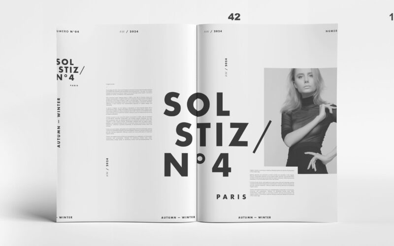
Solstiz
How can Soltiz N°4’s design balance bold creativity with clarity? The graphic identity merges minimalism and controlled chaos, crafting a refined yet raw look that captivates without overwhelming. The graphic design of Soltiz N°4,...