


More details
How can a daily, ordinary product like milk be transformed into a bold lifestyle icon? The challenge: create a design that is both pure and expressive, artisanal yet trendy.
The Milky Way brand uses a playful, contemporary graphic language that reinterprets the aesthetics of classic dairy products. With bold, hand-painted blue strokes crossing over modern black typography, the visual identity is both expressive and fresh. The combination of blue and white evokes purity and daily freshness, while the layered brush style adds energy and a human touch. Used consistently across bottles, cartons, and even apparel, the design transforms a traditional product into a fashion-forward lifestyle statement. Milky Way successfully blends artisanal cues with streetwear influences—turning your everyday milk into a graphic icon that’s as stylish as it is nutritious.
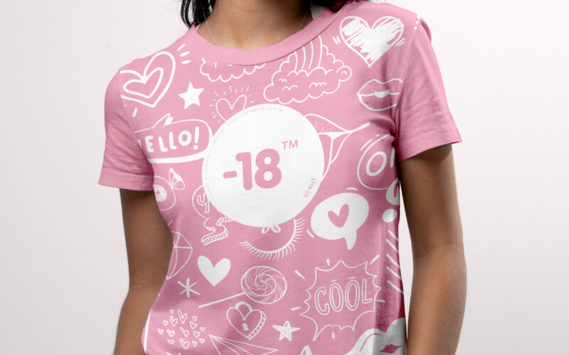
-18
How can a visual identity empower teenage girls through design? “-18” turns diary scribbles, irony, and soft tones into a playful code, creating a youthful, exclusive world that joyfully excludes adults. The graphic design for the brand...
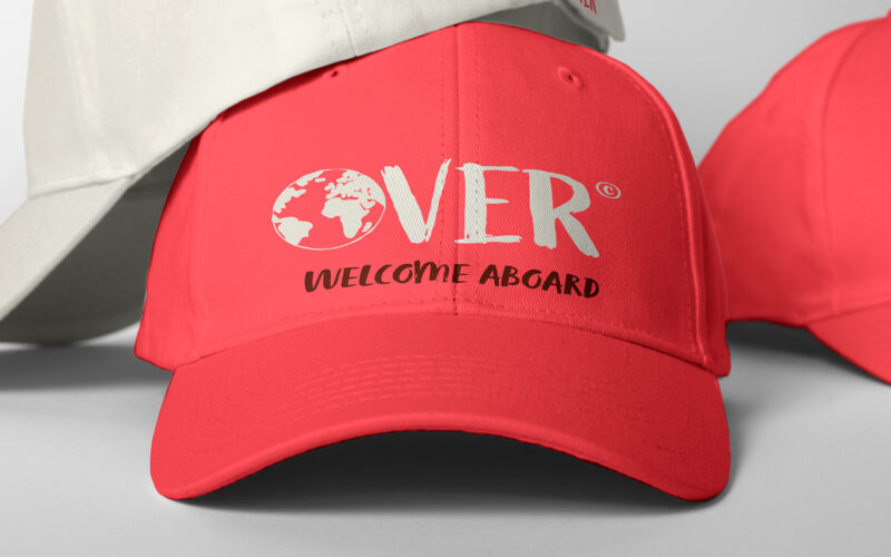
Over
How can Over’s graphic design express the spirit of authentic, joyful exploration through a warm, personal, and vibrant visual language that breaks from conventional travel norms? The graphic design for Over, a travel agency, captures a...
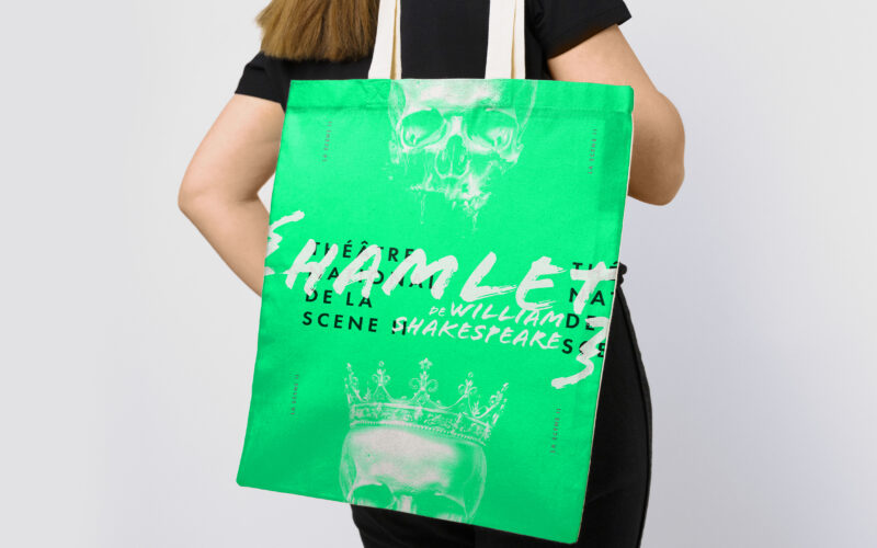
Scene II
Surface explores architectural duality through a bold red and white palette and a minimalist logo. Its 3D illusion balances flatness and volume, crafting a sleek, modern identity for the exhibition’s visual world. The graphic identity of...
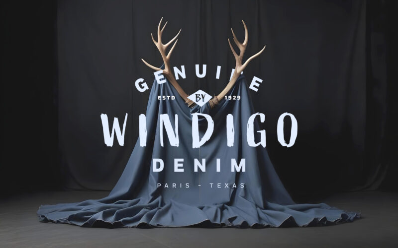
Windingo
How can graphic design express both raw wilderness and sensual heritage? Windigo’s denim brand challenges designers to merge mythical energy with vintage Texas roots in a bold, evocative visual identity. Windigo’s graphic design for its...