


More details
How can a visual identity translate the energy of travel — movement, direction, and discovery — through geometry and contrast, while maintaining a clear, modern sense of structure and destination?
This travel identity system for VIA captures the spirit of discovery through a sharp and modern geometric design. Bold yellow triangles intersect with black-and-white city photography, creating a striking visual dialogue between motion, structure, and destination. Each layout highlights iconic cities — Rome, London, New York, Paris — through dynamic compositions that evoke pathways and direction. The use of the “V” shape recalls both the brand name and the idea of travel routes converging. The contrast between vivid color and monochrome imagery reinforces a sense of clarity, precision, and modern wanderlust, expressing travel as a crafted and purposeful experience.
Over
How can Over’s graphic design balance playful structure and cultural symbolism to transform travel into an engaging, memorable journey that visually guides and excites its audience? The graphic design for Over, a travel agency, uses a...

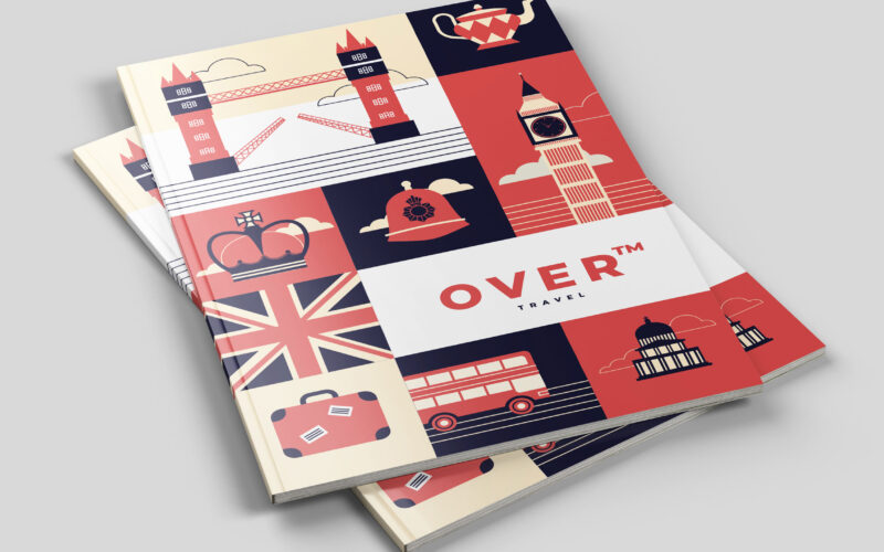
Over
How can a travel agency visually reinterpret classic adventure tales in a modern, playful flat design to evoke the joy, ease, and hopeful spirit of discovering new worlds? The graphic design for Over, a travel agency, draws inspiration...
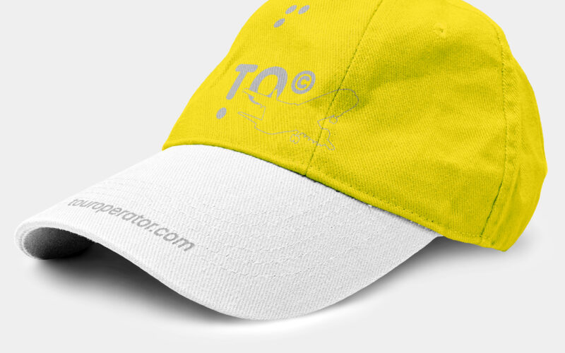
To
How can a travel brand balance clarity, movement, and meaning in one bold graphic system? TO’s challenge: symbolize both journey and destination, with a name that says it all—literally. TO—short for Tour Operator and the English...
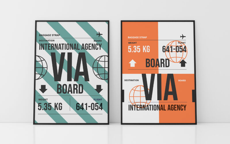
Via
How can a soap brand express both artisanal heritage and ecological commitment through design? Les Essencielles explores this through natural tones, delicate engravings, and sustainable materials that highlight purity and tradition. The...