


More details
How can graphic design visually translate the rhythm, spontaneity, and structure of jazz? The challenge: create a bold, cohesive identity that feels as alive and dynamic as the music itself.
The graphic design for the “TONE” Jazz Music Festival combines modernism with retro geometric flair. Displayed across a trio of posters, the visual identity uses bold blocks of red, navy, white, and pink to create rhythm and movement—mirroring the musical theme. Circular, triangular, and angular forms evoke vinyl records, sound waves, and architectural precision. The typography is clean and assertive, with the letter “O” playfully turned into a visual beat. This system of shapes and grids delivers a striking, consistent branding that is both festive and sophisticated. It celebrates jazz as structure and spontaneity—music in graphic motion.
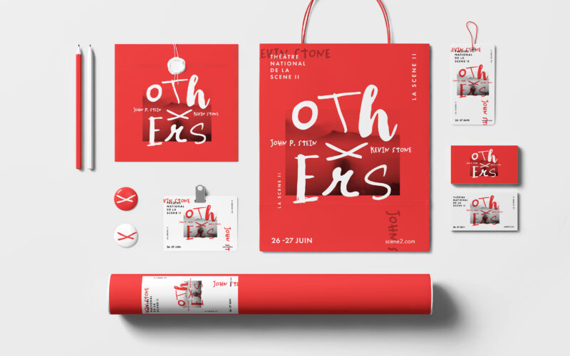
Others
How can graphic design convey reconstruction and the rewriting of truths, using fragmented typography and the “X” to reveal, conceal, and question the narratives of “the others”? The Others project builds a bold, minimalist identity...
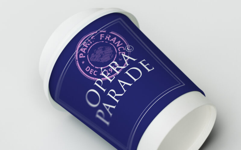
Opera Parade
How can Opéra Parade’s graphic design blend classical elegance with nomadic playfulness, turning each performance into a visual postcard that celebrates movement, music, and shared cultural journeys? The graphic identity for Opéra Parade,...
Scene II
Surface explores architectural duality through a bold red and white palette and a minimalist logo. Its 3D illusion balances flatness and volume, crafting a sleek, modern identity for the exhibition’s visual world. The graphic identity of...
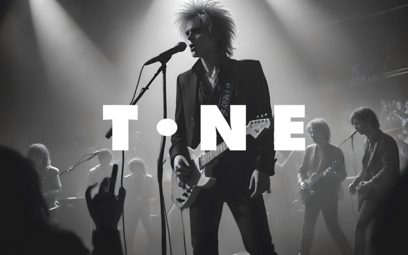
Tone
How can a website visually echo the universal language of music? The challenge: create a modular, adaptive design that feels rhythmic, immersive, and responsive—like music itself. The TONE website is a digital space dedicated to all forms...