


More details
How can graphic design balance tradition and modernity? Théâtre Les Arènes uses vibrant yellow and geometric motifs to explore how visual identity combines architectural heritage with contemporary clarity and dynamic creativity.
The visual identity of Théâtre Les Arènes features a bright, solar yellow as its dominant color, evoking energy, creativity, and visibility. The communication design is applied across posters, t-shirts, tote bags, badges, and stationery. A key graphic element is the use of the theater’s half-moon logo shape—echoing the architectural form of ancient arenas—which frames current production visuals and brings a dynamic rhythm to the layouts. This bold, circular motif is contrasted with a clean, structured typographic layout inspired by Swiss design, offering balance between contemporary vibrancy and classical clarity. The result is an identity both striking and elegant.
Scene II
Surface explores architectural duality through a bold red and white palette and a minimalist logo. Its 3D illusion balances flatness and volume, crafting a sleek, modern identity for the exhibition’s visual world. The graphic identity of...
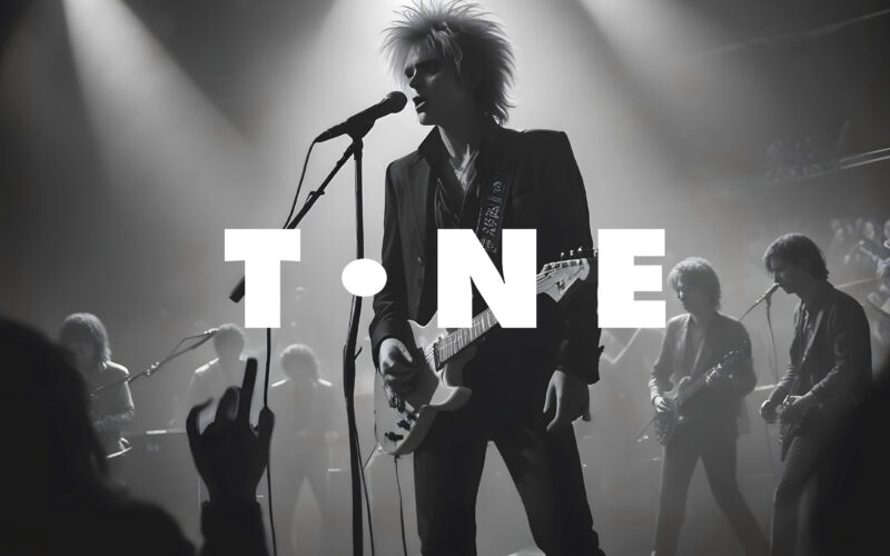
Tone
How can a website visually echo the universal language of music? The challenge: create a modular, adaptive design that feels rhythmic, immersive, and responsive—like music itself. The TONE website is a digital space dedicated to all forms...
Tone
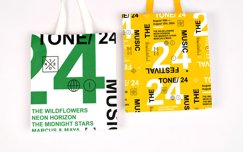
How can graphic design capture youthful energy and spontaneity for a music festival? TONE 24 uses bright colors and dynamic typography, creating a playful, DIY aesthetic that celebrates rhythm and community. The visual identity of TONE 24,...
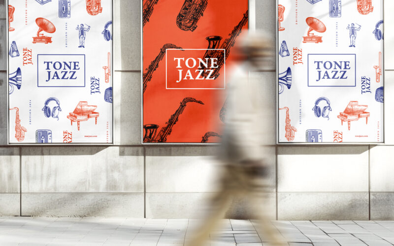
Tone Jazz
How does graphic design balance tradition and modernity for a jazz festival? TONE JAZZ uses orange and blue with intricate musician engravings, blending vintage charm and contemporary clarity in a cohesive visual identity. The visual...