MADAM champagne blends tradition and modern elegance, echoing legacy brands led by women. But how can a new name assert heritage and authenticity in an industry defined by centuries-old maisons? This elegant champagne packaging features...
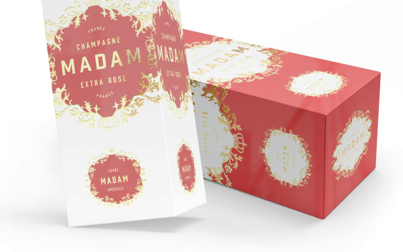

MADAM champagne blends tradition and modern elegance, echoing legacy brands led by women. But how can a new name assert heritage and authenticity in an industry defined by centuries-old maisons? This elegant champagne packaging features...
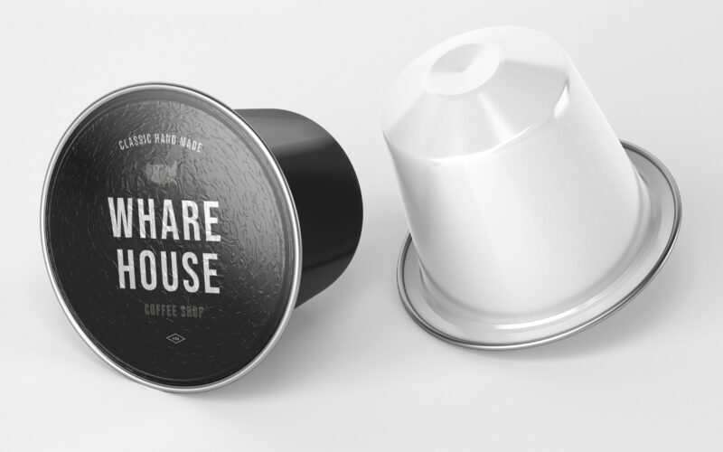
How can graphic design communicate both craftsmanship and eco-conscious professionalism? Whare House uses vintage textures, natural kraft tones, and a clear system to reflect heritage, authenticity, and refined coffee expertise. The...
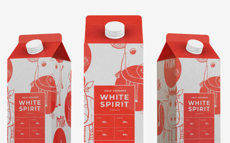
Playful and endearing, White Spirit features childlike cow illustrations that give the packaging a joyful, youthful spirit. The name evokes the color and purity of milk, while red polka dots scattered across the design recall cowhide...
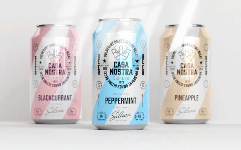
How can graphic design express light rebellion while remaining approachable?Casa Nostra uses pastel ribbons and a vintage octopus motif to playfully evoke Prohibition-era mafia culture, blending humor, heritage, and visual softness with...
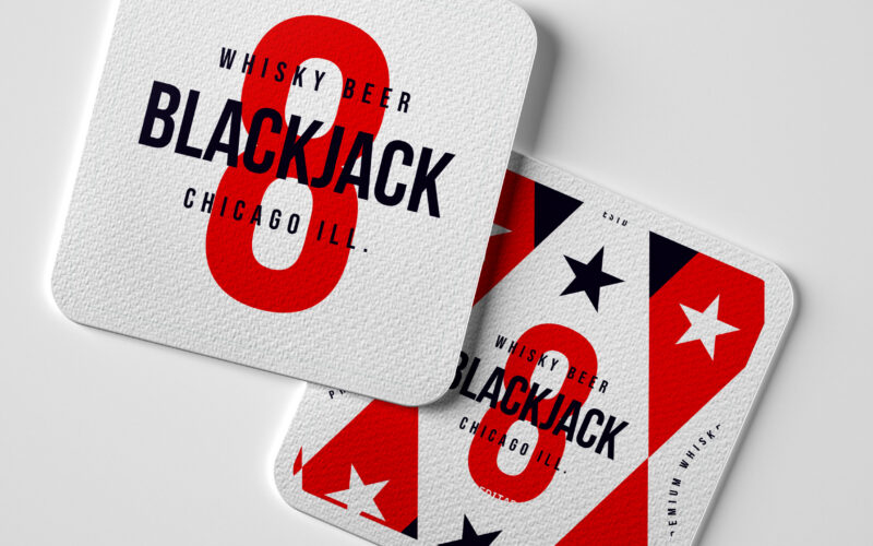
How can a whiskey beer brand capture the festive, luck-driven spirit of casinos through bold patriotic colors and playful symbolism, while conveying a sense of collection and responsible enjoyment? Cheeky and celebratory, Black Jack 8...
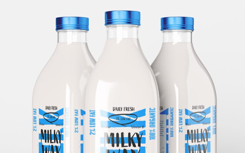
How can a daily, ordinary product like milk be transformed into a bold lifestyle icon? The challenge: create a design that is both pure and expressive, artisanal yet trendy. The Milky Way brand uses a playful, contemporary graphic language...
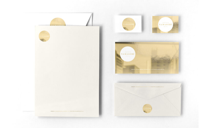
How can a tea salon brand visually express both the refined quality of its products and the joyful diversity of its flavors through a simple, elegant, and timeless graphic system? The graphic design for Namasthé teahouse brand blends...
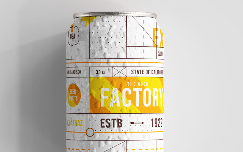
Playful and rebellious, The Rock Factory (The nickname given to Alcatraz prison) draws its identity from Alcatraz’s infamous legacy, turning its cans into coded messages of escape. Referencing the prison once home to Al Capone, the brand...
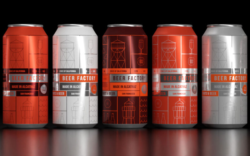
How can design blend heritage and rebellion? Beer Factory’s orange prison cell panels and wireframe illustrations evoke Alcatraz’s legacy, creating a playful, subversive identity that celebrates craft brewing and transformation. The 33cl...
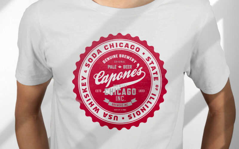
How can design capture heritage and rebellion? Capone’s vintage label, with deep red tones and handwritten typography, evokes Prohibition-era Chicago, blending bold whiskey elements to reflect the beer’s daring character. The 33cl glass...
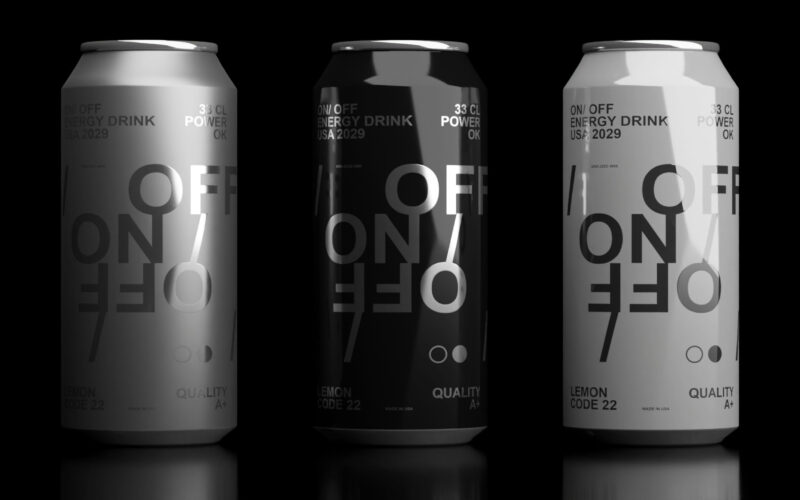
How can design express modern masculinity and energy? On-Off’s sleek black-and-white cans with subtle Helvetica typography reflect raw power and elegance, matching a bold soda flavor that energizes body and mind. "On/Off" is a soda graphic...
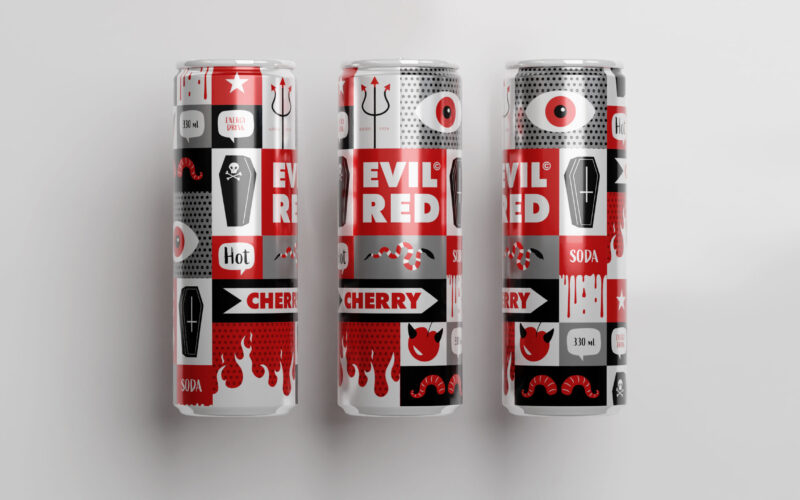
How does packaging express rebellious energy? Evil Red’s comic-inspired design uses bold red panels and mischievous imagery to capture a cheeky, edgy spirit, matching the soda’s spicy, nightlife vibe. The 33cl aluminum can for "Evil Red"...
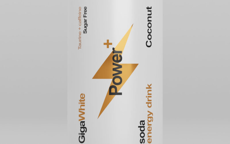
Power+ cans evoke sleek Swiss design with a battery-inspired motif symbolizing energy. Black, white, and gold accents highlight premium flavors, combining minimalism, clarity, and strength for an efficient, sophisticated look. The 33cl...
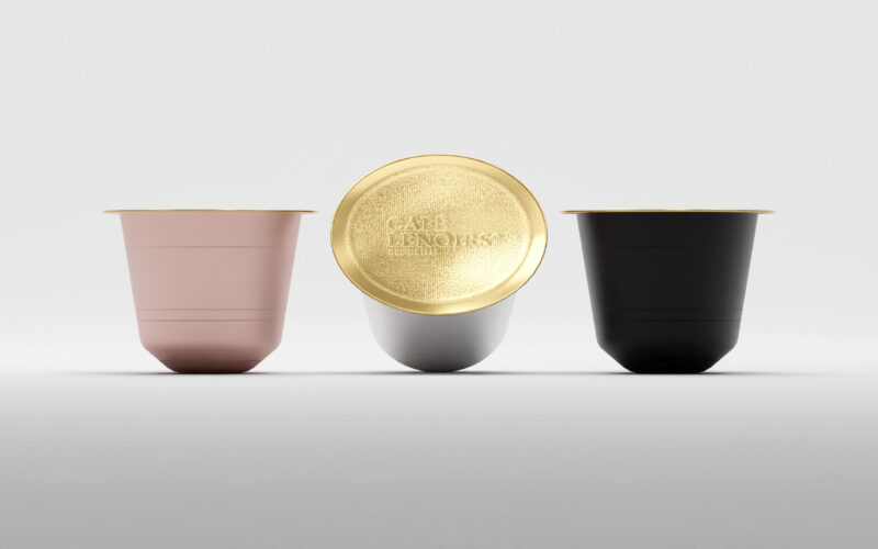
Café Lenoirs packaging uses colored craft paper with clean, cartridge-style text boxes. Black, pink, white, and gold indicate coffee intensity, reflecting organic, fair trade values in a minimalist, sophisticated design. The packaging for...
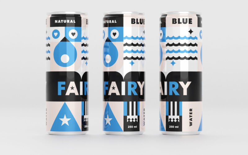
Blue Fairy’s 33cl can features gentle blues and pale pinks with geometric, childlike shapes evoking water, stars, and hearts. The design radiates calm, magic, and youthful whimsy for a soothing experience. The 33cl aluminum can for "Blue...