


More details
How can a whiskey beer brand capture the festive, luck-driven spirit of casinos through bold patriotic colors and playful symbolism, while conveying a sense of collection and responsible enjoyment?
Cheeky and celebratory, Black Jack 8 mixes the thrill of casino games with the bold character of whisky-infused beer. Its name plays on the iconic card game and the lucky number 8, suggesting a collectible series with other numbers to follow. The visual language borrows from casino aesthetics—stars, diamonds, bold typography—creating a playful, adult-oriented design. Rendered in red, white, and blue, the identity evokes the mood of a festive national holiday, positioning the drink as both indulgent and rebellious. Applied to bottles, boxes, and coasters, the design invites consumers to treat each sip like a daring bet with a smile.
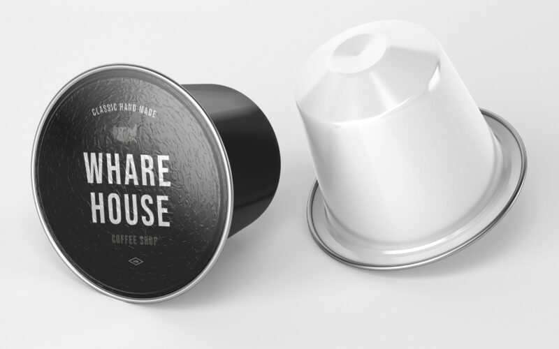
Wharehouse
How can graphic design communicate both craftsmanship and eco-conscious professionalism? Whare House uses vintage textures, natural kraft tones, and a clear system to reflect heritage, authenticity, and refined coffee expertise. The...
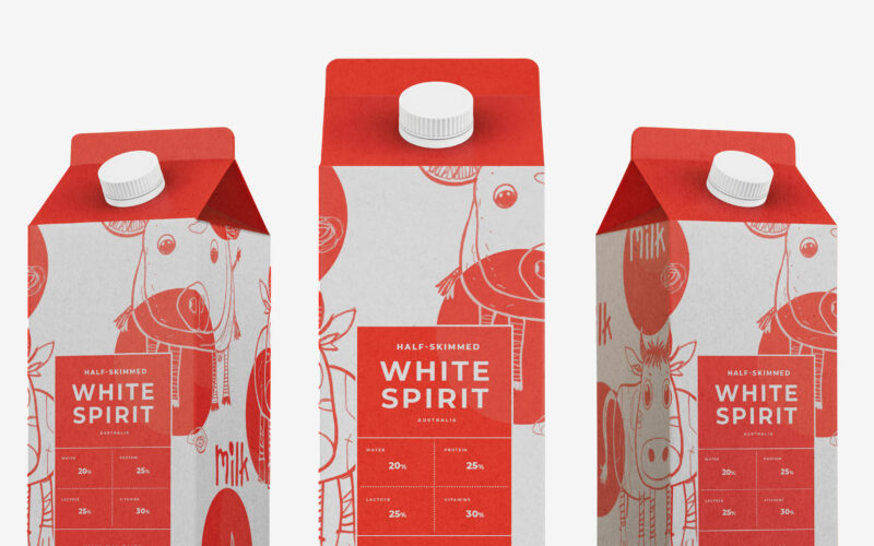
White Spirit
Playful and endearing, White Spirit features childlike cow illustrations that give the packaging a joyful, youthful spirit. The name evokes the color and purity of milk, while red polka dots scattered across the design recall cowhide...
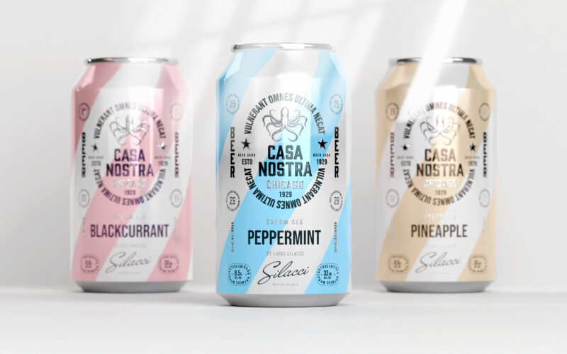
Casa Nostra
How can graphic design express light rebellion while remaining approachable?Casa Nostra uses pastel ribbons and a vintage octopus motif to playfully evoke Prohibition-era mafia culture, blending humor, heritage, and visual softness with...
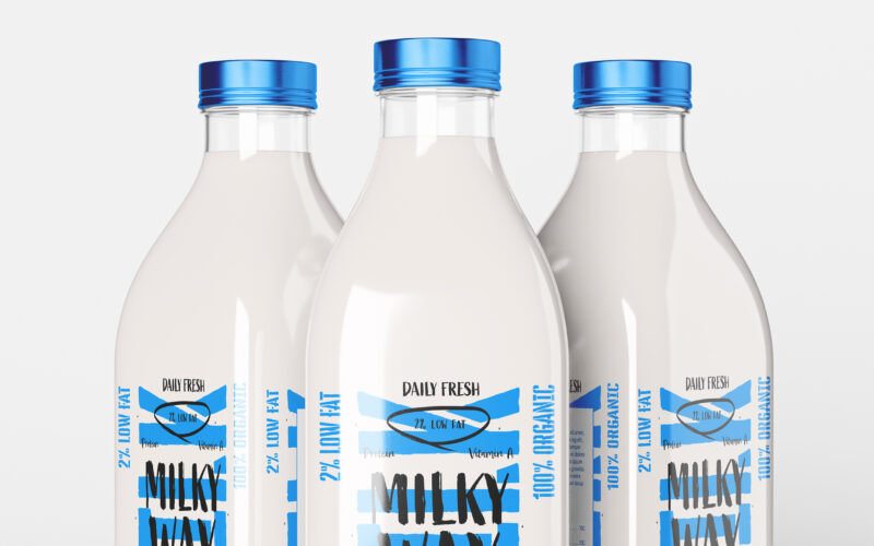
Milky Way
How can a daily, ordinary product like milk be transformed into a bold lifestyle icon? The challenge: create a design that is both pure and expressive, artisanal yet trendy. The Milky Way brand uses a playful, contemporary graphic language...