


More details
Power+ cans evoke sleek Swiss design with a battery-inspired motif symbolizing energy. Black, white, and gold accents highlight premium flavors, combining minimalism, clarity, and strength for an efficient, sophisticated look.
The 33cl aluminum can for “Power+” energy drink features a simple, informative Swiss-style graphic design, emphasizing clarity and precision. The can is designed to resemble a battery, symbolizing energy and power. The dominant colors—black and white—vary depending on the flavor, while gold accents provide a premium touch, reminiscent of high-quality battery variations. The minimalistic design is sleek and functional, aligning with the brand’s focus on energy and performance. The overall aesthetic conveys a sense of reliability and strength, while the clean, modern look appeals to consumers seeking both efficiency and sophistication in their energy drink.
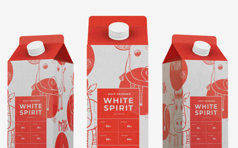
White Spirit
Playful and endearing, White Spirit features childlike cow illustrations that give the packaging a joyful, youthful spirit. The name evokes the color and purity of milk, while red polka dots scattered across the design recall cowhide...
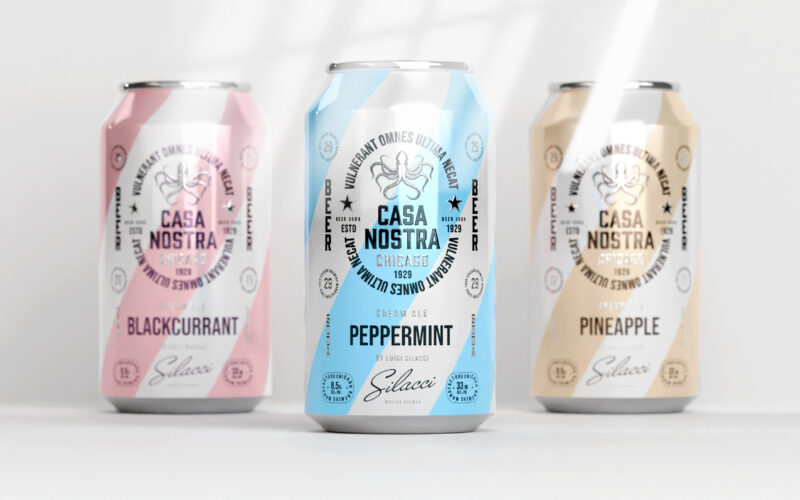
Casa Nostra
How can graphic design express light rebellion while remaining approachable?Casa Nostra uses pastel ribbons and a vintage octopus motif to playfully evoke Prohibition-era mafia culture, blending humor, heritage, and visual softness with...
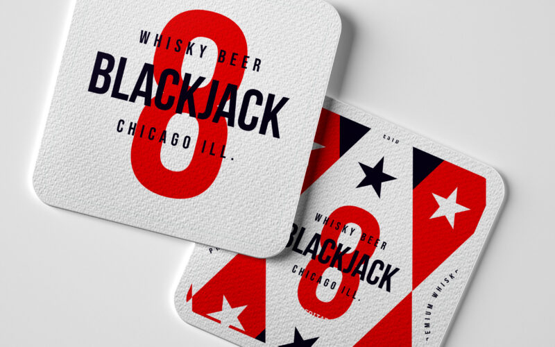
Blackjack
How can a whiskey beer brand capture the festive, luck-driven spirit of casinos through bold patriotic colors and playful symbolism, while conveying a sense of collection and responsible enjoyment? Cheeky and celebratory, Black Jack 8...
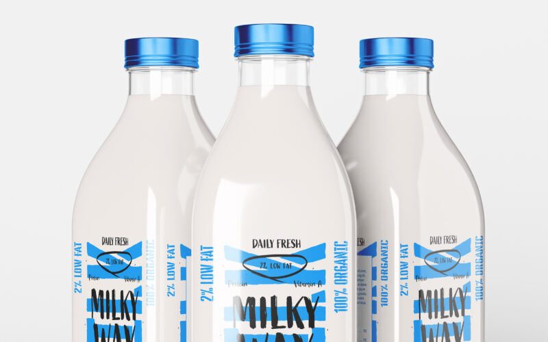
Milky Way
How can a daily, ordinary product like milk be transformed into a bold lifestyle icon? The challenge: create a design that is both pure and expressive, artisanal yet trendy. The Milky Way brand uses a playful, contemporary graphic language...