UNBRAKE: Formula One delivers high-octane visuals and sleek design. But can packaging alone convey the depth and realism needed to engage discerning motorsport gamers beyond surface-level excitement? This dynamic design showcases a premium...
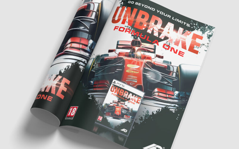

UNBRAKE: Formula One delivers high-octane visuals and sleek design. But can packaging alone convey the depth and realism needed to engage discerning motorsport gamers beyond surface-level excitement? This dynamic design showcases a premium...
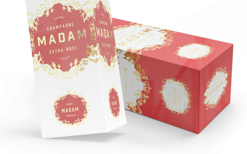
MADAM champagne blends tradition and modern elegance, echoing legacy brands led by women. But how can a new name assert heritage and authenticity in an industry defined by centuries-old maisons? This elegant champagne packaging features...
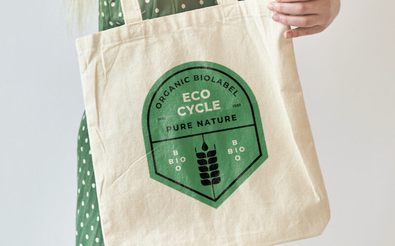
How can ecological certification be visually translated into a recognizable, trustworthy emblem—one that conveys sustainable values and speaks meaningfully to both producers and consumers through form, color, and material? At the center of...
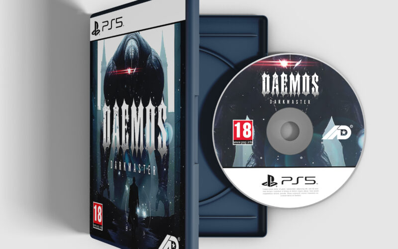
DAEMOS: Darkmaster’s packaging evokes cinematic horror and dark fantasy. But in a saturated market, can visual intensity alone distinguish a game and build lasting appeal among genre fans? This captivating design showcases the dark,...
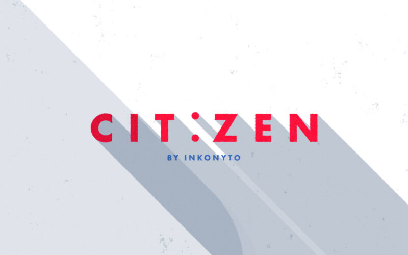
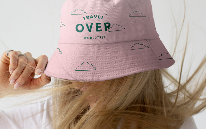
How can intercity travel be simplified and seamless? Citizen answers with a colorful, flat-design film showcasing a smooth journey from New York to London, emphasizing ease, connectivity, and global reach. Citizen is a service designed to...
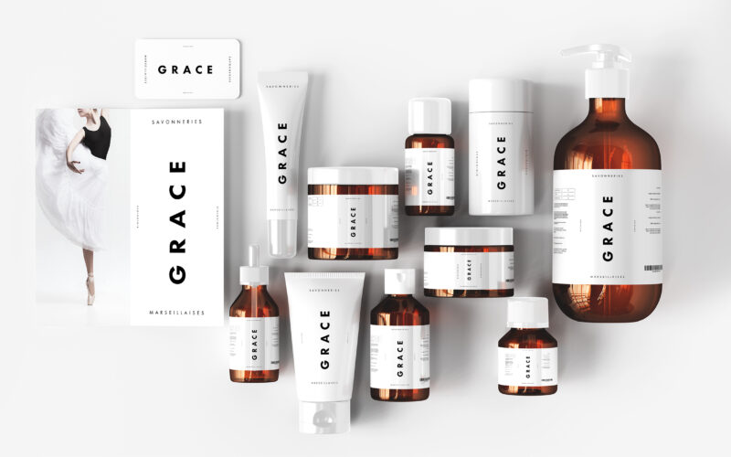
The graphic design of Grace by Les Savonneries Marseillaises is featured on cosmetics, bags, booklets, and posters. With a dominant white palette, the design is stripped to its minimalist core, evoking clinical purity and the essential...
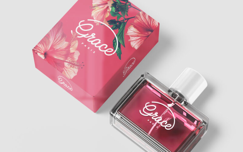
How can a perfume brand embody grace — as elegance, as a name, and as a place — through design and storytelling, to create an emotional universe rooted in beauty and floral heritage? Grace is a fragrance brand that evokes elegance,...
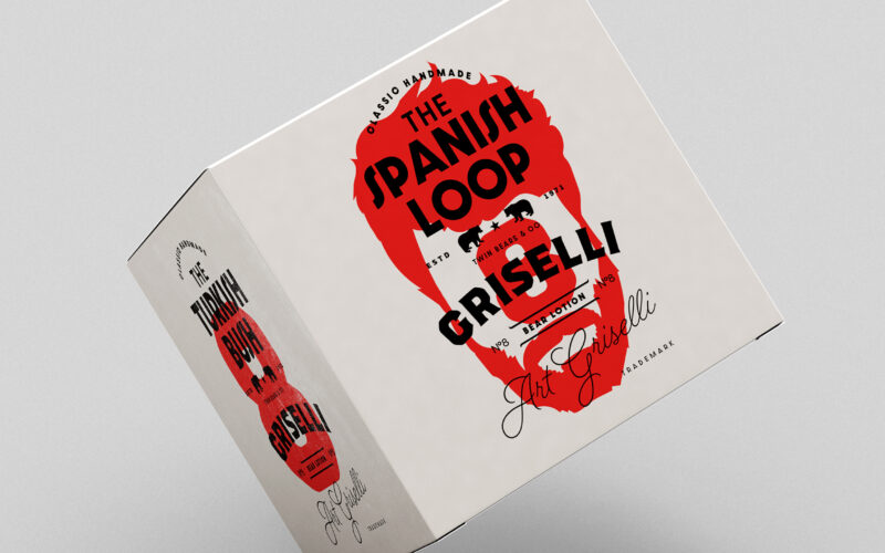
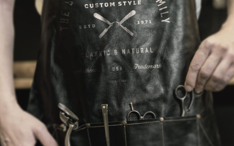
How can a grooming brand express both artisanal tradition and rebellious identity through graphic design that blends symbolism, personalization, and a touch of vintage, all while embracing its wild, “bear-like” roots? The graphic design...
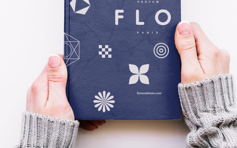
Mysterious and refined, FLO evokes intimacy and enchantment through just three letters—an affectionate abbreviation of Florenz Bloom, the creator’s name, whispered like a secret among close friends. Set against a dark blue background, the...
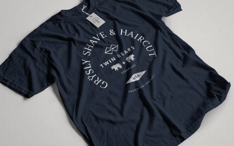
How can graphic design channel primal masculinity and refined craftsmanship into a cohesive identity? Grÿsly explores this balance through bold colors, wild imagery, and vintage codes rooted in nature and heritage. The graphic design of...
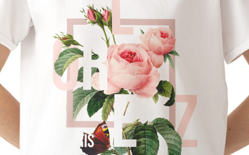
How can graphic design express the emotional richness of a fragrance brand—merging romantic intensity, layered storytelling, and floral abundance—while maintaining clarity, elegance, and a deeply personal artistic identity? Vibrant and...
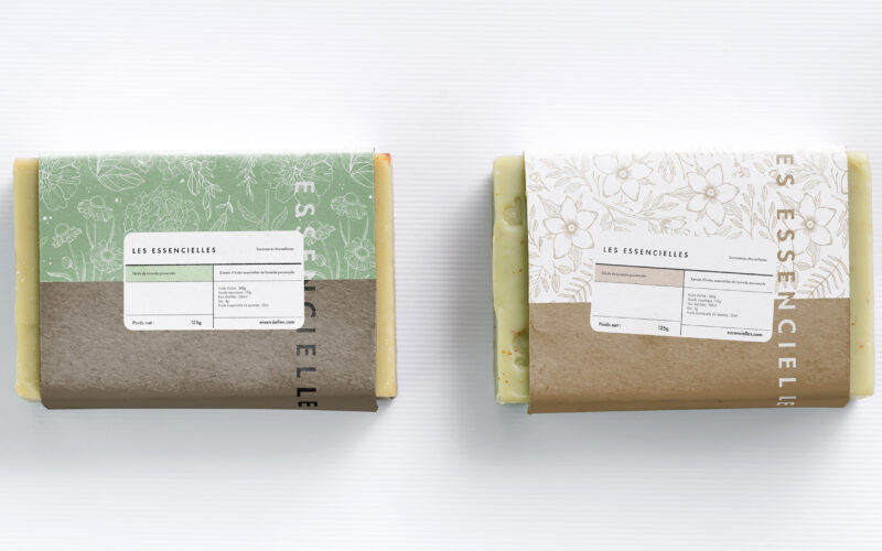
How can a soap brand express both artisanal heritage and ecological commitment through design? Les Essencielles explores this through natural tones, delicate engravings, and sustainable materials that highlight purity and tradition. The...
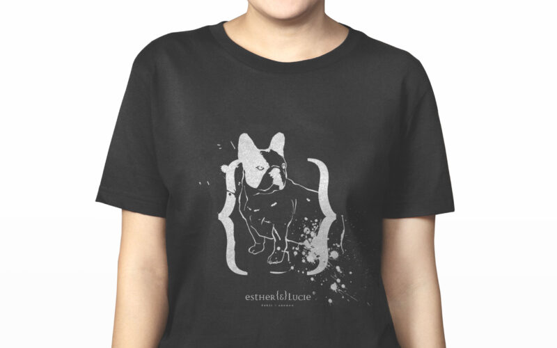
How can a cosmetics brand embody individuality, irreverence, and friendship through design? Esther {&} Lucie merges personal storytelling, punk-inspired ink marks, and hand-drawn portraits into a playful, rebellious visual identity....
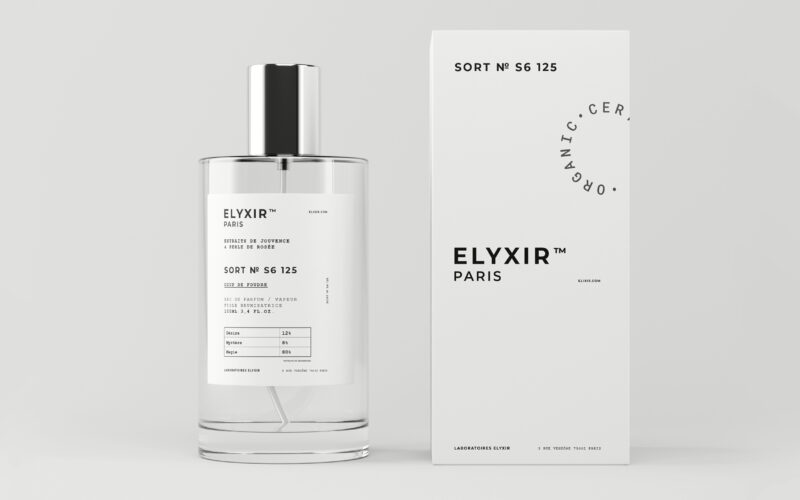
How can a perfume brand visually balance the clinical codes of science with the mystical allure of emotions, creating a design that feels both pharmaceutical and enchantingly magical? The graphic design for Elyxir, a fragrance line, plays...
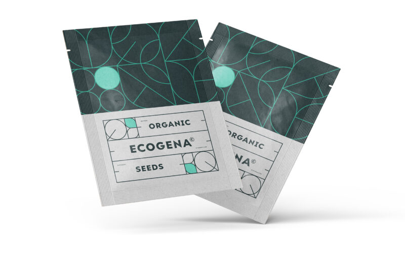
How can graphic design express both ecological sensitivity and scientific rigor? Ecogena balances organic motifs with structured layouts, crafting a visual identity that feels both natural and technical—designed for serious, sustainable...
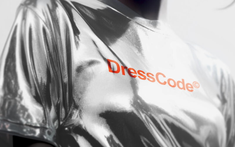
How can a brand assert elegance without shouting? DressCode’s challenge lies in building a visual identity that balances neutrality and boldness—structured enough to guide, flexible enough to express individuality. Sharp and structured,...
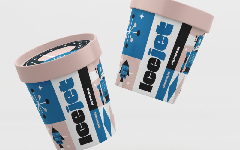
How can IceJet’s graphic design capture children’s imagination by blending nostalgic space-age visuals with playful colors and characters, creating a joyful, adventurous brand that makes ice cream a cosmic journey? The graphic design for...
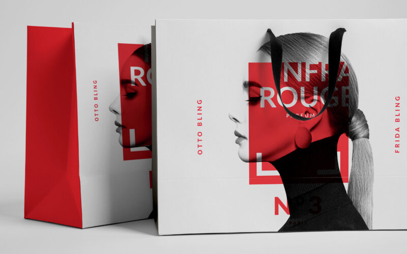
How can Infrarouge’s graphic design express deep emotion and sensuality through a modern, precise aesthetic that reveals passion while balancing scientific clarity and intimate intensity? Red becomes a language of emotion in Infrarouge,...
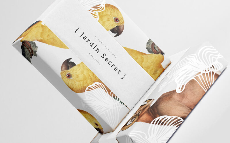
How can Jardin Secret’s graphic design balance vibrant natural imagery with intimacy and exclusivity, creating a fresh, radiant identity that evokes a personal sensory escape in eco-friendly packaging? Bright and lush, {Jardin Secret} by...
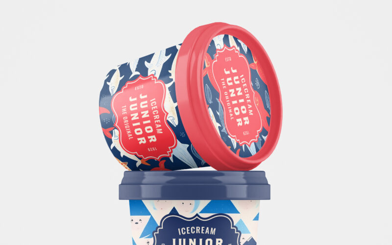
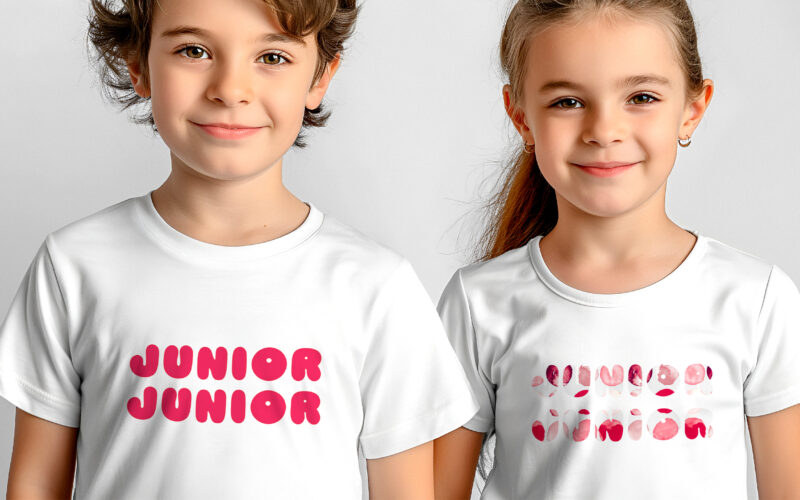
How can Junior Junior’s graphic design capture playful nostalgia while appealing to children and adults alike, blending vintage charm with modern joy through colorful, whimsical packaging? Junior Junior brings a burst of playful nostalgia...
How can we design a visual identity that is playful and appealing to children, while also reassuring parents with a clear, modern message that communicates quality and trustworthiness? This graphic design showcases a playful and colorful...
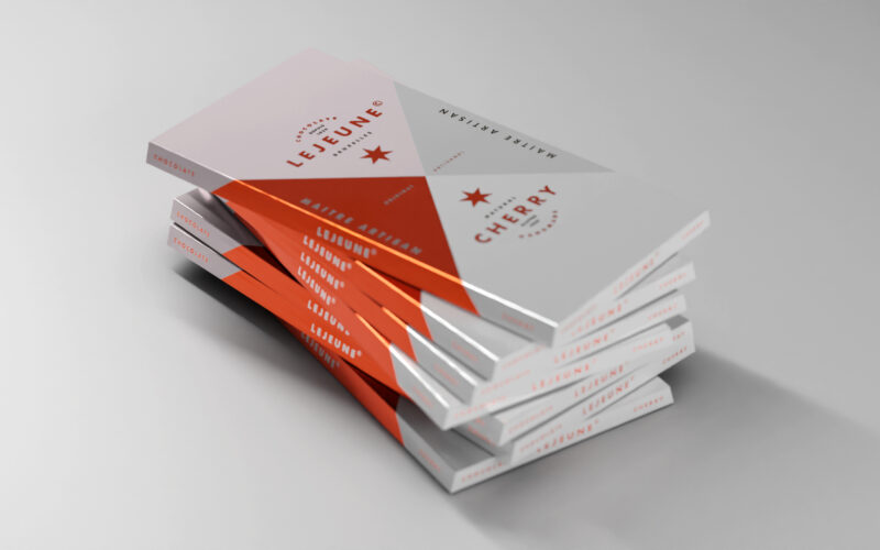
How can a chocolate packaging communicate artisanal excellence while standing out on modern shelves? Lejeune solves this by merging geometric purity, heritage cues, and premium finishes into a timeless graphic identity. The packaging...
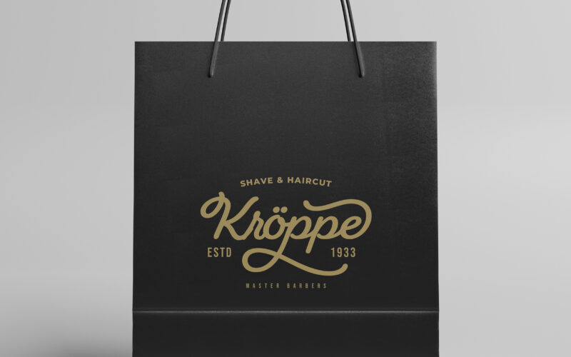
How can graphic design express heritage, masculinity, and expertise in modern men’s cosmetics? Kroppe’s challenge: create a timeless identity that feels both historic and premium, with unmistakable character. Kroppe’s graphic design...
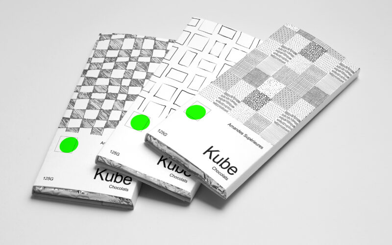
How can Kube’s graphic design use simple geometric forms and minimal color to communicate artisanal authenticity and purity in a bold yet understated way? Bold in simplicity, the identity of Kube centers on the square—both as form and...
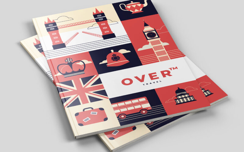
How can Over’s graphic design balance playful structure and cultural symbolism to transform travel into an engaging, memorable journey that visually guides and excites its audience? The graphic design for Over, a travel agency, uses a...
How can a travel agency visually reinterpret classic adventure tales in a modern, playful flat design to evoke the joy, ease, and hopeful spirit of discovering new worlds? The graphic design for Over, a travel agency, draws inspiration...
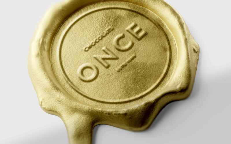
How can design elevate a chocolate bar into a golden ingot — where “once” embodies both an ounce of gold and a unique, precious moment of indulgence? ONCE merges two meanings into one elegant concept — “once,” as in something rare and...
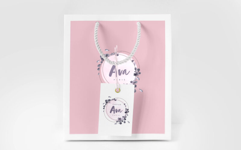
How can graphic design translate fragrance into emotion? AVA’s identity explores softness and intimacy through pale tones, floral frames, and handwritten details—turning visual elements into a delicate, sensory expression of femininity....
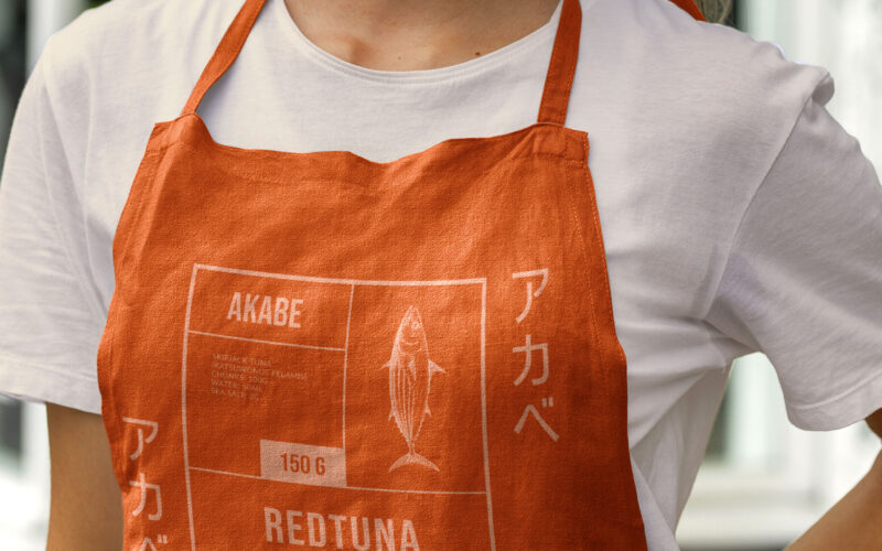
How can canned seafood feel both luxurious and disciplined? Akabe’s graphic identity fuses Japanese minimalism with maritime heritage—using coral hues and compartmental layouts to express artisanal quality through elegant, functional...
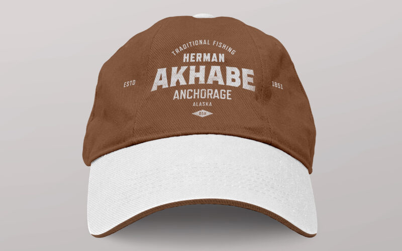
How can a seafood brand channel literary legacy and bold character? Akhabe’s design fuses vintage Americana with maritime grit, using a strong central figure to anchor a timeless yet contemporary visual identity. “Akhabe” is a premium...
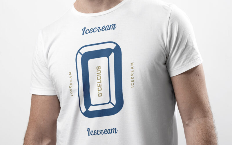
How to visually blend nostalgia and freshness? Zero’s retro-inspired design uses bold typography and vintage imagery, mixing icy whites with elegant blues and golds to evoke timeless American dessert charm. Cool and nostalgic, Zero (or 0°...
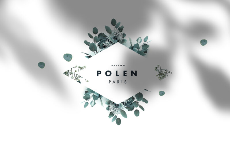
How to balance minimalism with nature’s poetry? Polen’s design uses white and green with subtle floral motifs and geometric framing, creating a refined identity that highlights purity and delicate beauty. The graphic design of Polen, a...
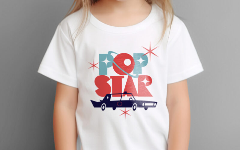
How can ice cream packaging evoke nostalgia, glamour, and space-age adventure? Popstar’s graphic challenge is to turn a simple treat into a retro-futuristic journey through identity and imagination. Popstar’s graphic design blends...
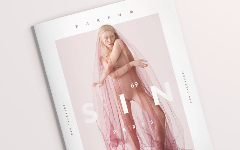
How can SIN⁶⁹’s design express sensuality while maintaining elegance? The minimalist typography and subtle typographic twist balance provocative meaning with refined visual restraint, creating a compelling, intimate brand identity. The...
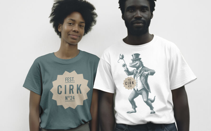
How can CIRK N°24’s graphic design capture both nostalgia and surreal imagination? Through rich colors and mythical engravings, the identity creates a poetic, theatrical world balancing whimsy and eerie wonder. The visual identity of CIRK...
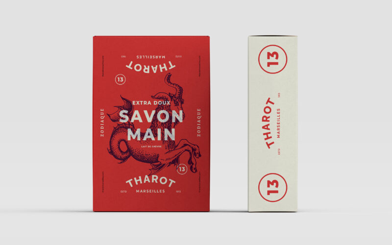
How can graphic design merge tradition and mysticism in product packaging? Tharot des Savonneries Marseillaises uses vintage zodiac engravings and a tricolor palette to evoke heritage and artisan craft. The visual identity for Tharot des...
How can graphic design balance tradition and modern irreverence for a men’s cosmetics brand? The Sweeney Todd Family uses vintage black and gold tones with playful irony to convey elegance and humor. The graphic design for The Sweeney Todd...
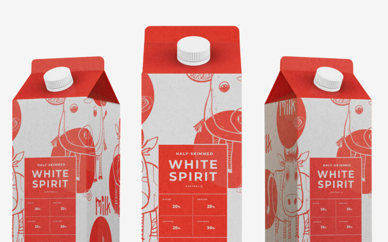
Playful and endearing, White Spirit features childlike cow illustrations that give the packaging a joyful, youthful spirit. The name evokes the color and purity of milk, while red polka dots scattered across the design recall cowhide...
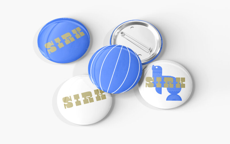
How can graphic design reinterpret nostalgic imagery with a fresh, contemporary tone? SIRK revives vintage circus icons through playful motifs and rhythmic elegance, blending 1950s charm with modern visual poetry. Playful and poetic, the...
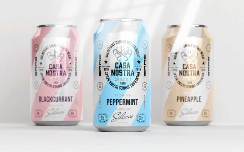
How can graphic design express light rebellion while remaining approachable?Casa Nostra uses pastel ribbons and a vintage octopus motif to playfully evoke Prohibition-era mafia culture, blending humor, heritage, and visual softness with...
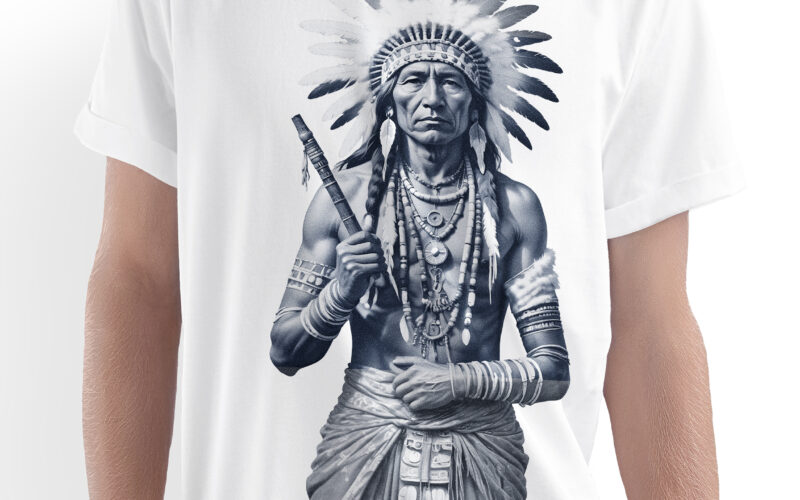
Evoking tradition and dignity, Blue Calumet presents a vintage-inspired identity centered around a finely detailed medallion engraving of a Native American figure holding a ceremonial pipe. The composition balances ornamental motifs with a...
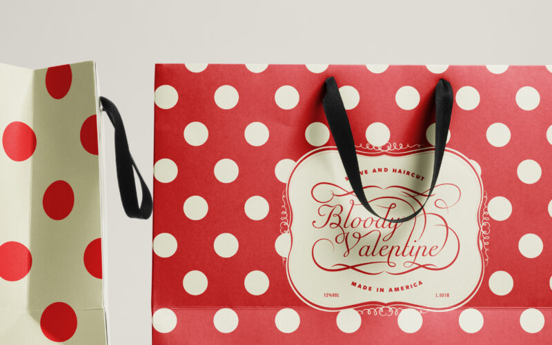
How can a graphic identity balance elegance and intensity, using color, typography, and composition to express both romance and danger while maintaining a refined, luxurious brand presence? The Bloody Valentine branding concept blends...
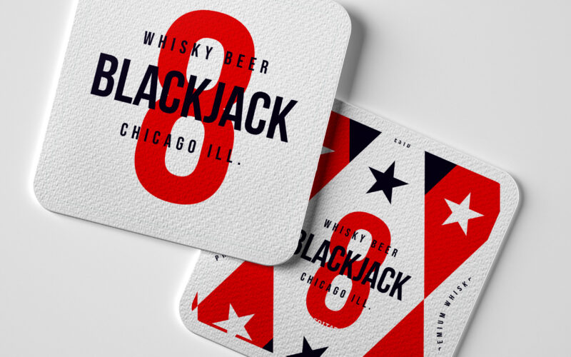
How can a whiskey beer brand capture the festive, luck-driven spirit of casinos through bold patriotic colors and playful symbolism, while conveying a sense of collection and responsible enjoyment? Cheeky and celebratory, Black Jack 8...
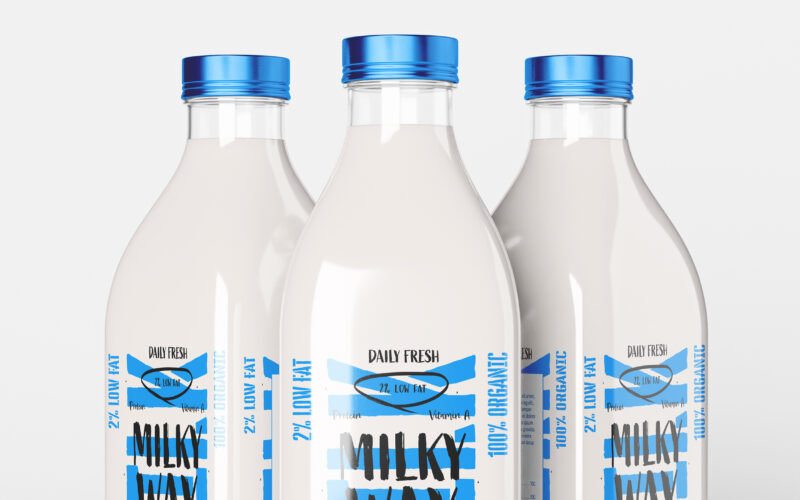
How can a daily, ordinary product like milk be transformed into a bold lifestyle icon? The challenge: create a design that is both pure and expressive, artisanal yet trendy. The Milky Way brand uses a playful, contemporary graphic language...
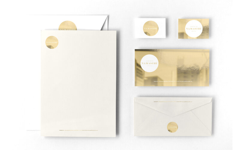
How can a tea salon brand visually express both the refined quality of its products and the joyful diversity of its flavors through a simple, elegant, and timeless graphic system? The graphic design for Namasthé teahouse brand blends...
Playful and rebellious, The Rock Factory (The nickname given to Alcatraz prison) draws its identity from Alcatraz’s infamous legacy, turning its cans into coded messages of escape. Referencing the prison once home to Al Capone, the brand...
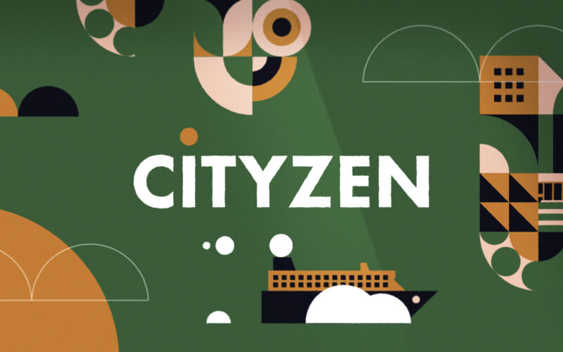
How can intercity travel feel simple, joyful, and stress-free? Cityzen answers with a playful, colorful identity and cheerful visuals that turn booking transport into a light, carefree experience across all platforms. The brand identity...
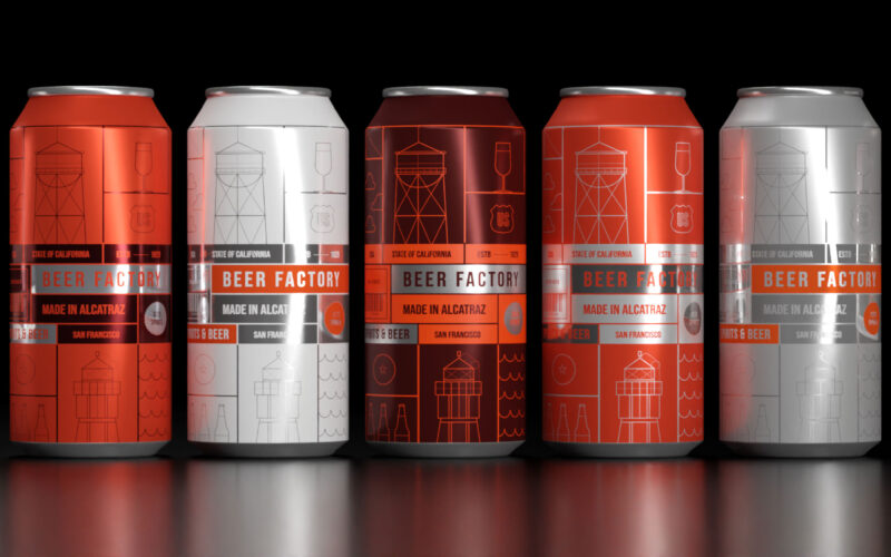
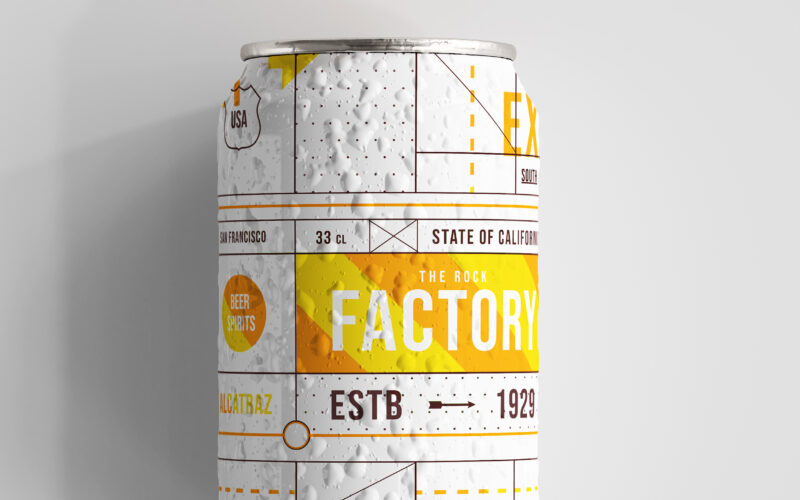
How can design blend heritage and rebellion? Beer Factory’s orange prison cell panels and wireframe illustrations evoke Alcatraz’s legacy, creating a playful, subversive identity that celebrates craft brewing and transformation. The 33cl...
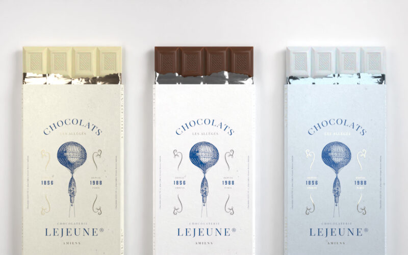
How can design balance tradition and modernity? Les Allégés’ vintage hot air balloon and soft colors evoke lightness and elegance, blending Jules Verne’s heritage with a fresh, imaginative chocolate experience. The "Les Allégés" chocolate...
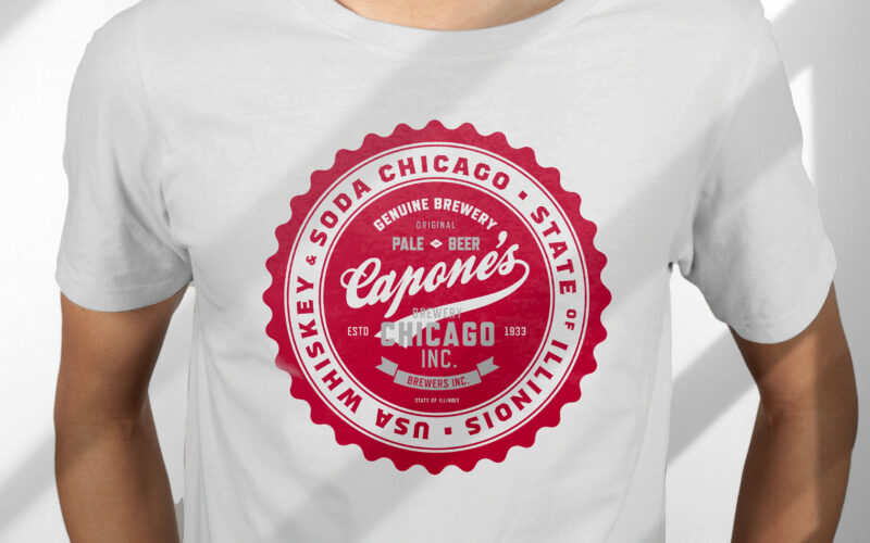
How can design capture heritage and rebellion? Capone’s vintage label, with deep red tones and handwritten typography, evokes Prohibition-era Chicago, blending bold whiskey elements to reflect the beer’s daring character. The 33cl glass...
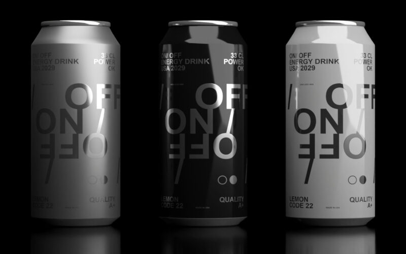
How can design express modern masculinity and energy? On-Off’s sleek black-and-white cans with subtle Helvetica typography reflect raw power and elegance, matching a bold soda flavor that energizes body and mind. "On/Off" is a soda graphic...
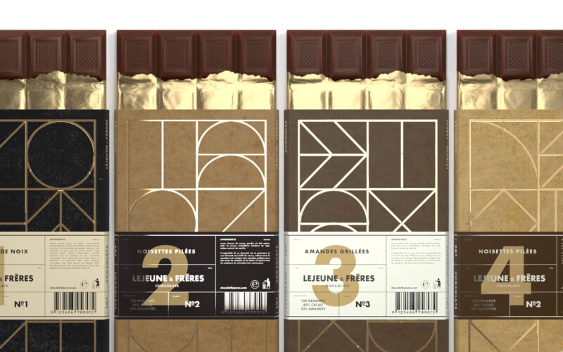
How can design merge luxury and sustainability? Lejeune & Frères’ Neo-Art Deco gold patterns on recycled cardboard create a premium, eco-friendly chocolate packaging that balances sophistication with modern artisanal values. The 125g...
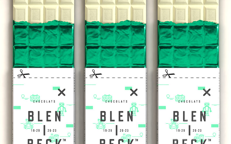
How can packaging express playful sophistication? Blen-Beck’s bold black, bright green, and silver colors with whimsical toy illustrations create a joyful, mischievous identity, reflecting a fun Belgian chocolate that breaks conventions....
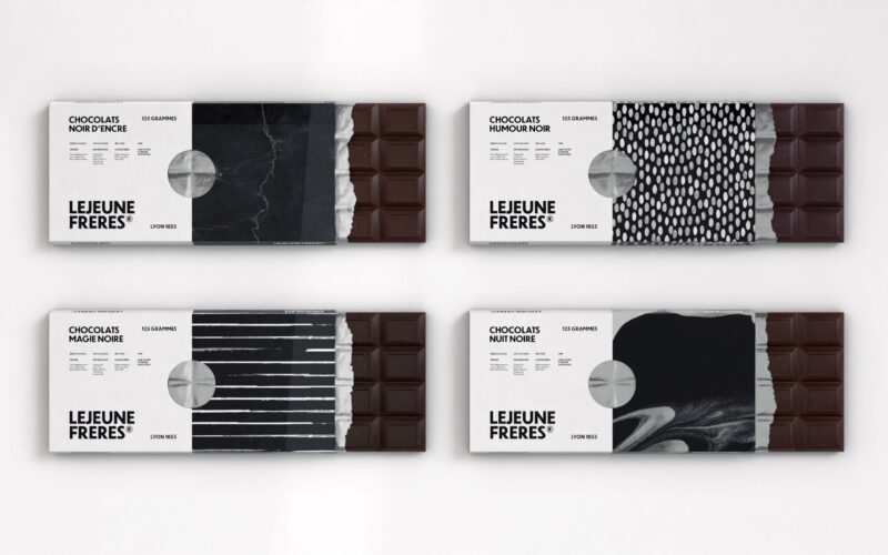
How can packaging convey artisanal luxury? Chocolats Lejeune’s minimalist black-and-white design, textured for each variant, combines elegance and freshness with a foil reveal, embodying the refined essence of premium dark chocolate. The...
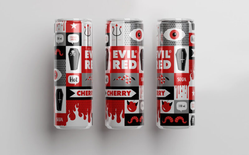
How does packaging express rebellious energy? Evil Red’s comic-inspired design uses bold red panels and mischievous imagery to capture a cheeky, edgy spirit, matching the soda’s spicy, nightlife vibe. The 33cl aluminum can for "Evil Red"...
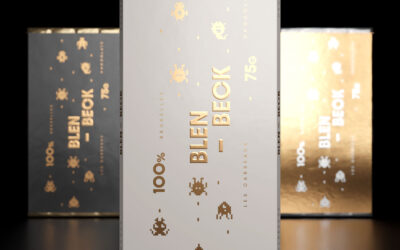
Blen-Beck’s playful pixel-art packaging channels classic video games with pixelated creatures and chocolate-inspired squares. The black, gold, and white palette adds whimsy and premium flair, appealing to kids and nostalgic geeks alike....
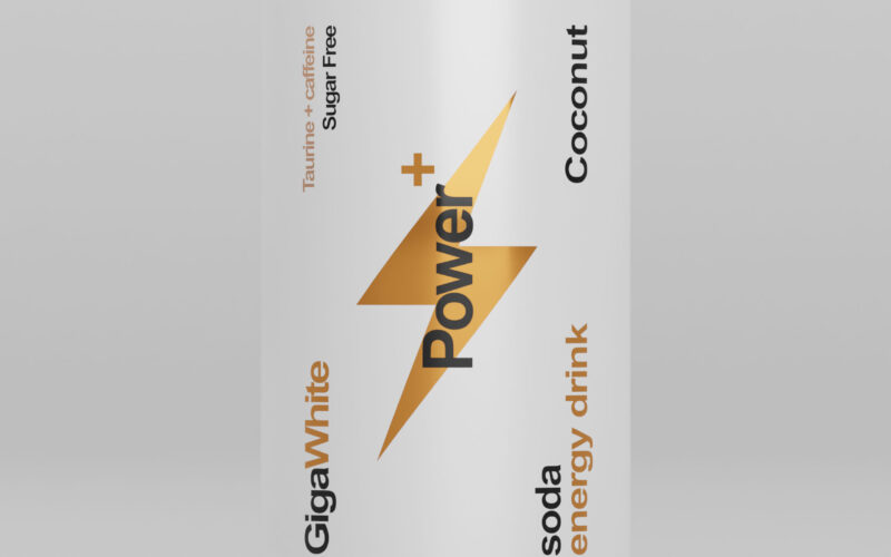
Power+ cans evoke sleek Swiss design with a battery-inspired motif symbolizing energy. Black, white, and gold accents highlight premium flavors, combining minimalism, clarity, and strength for an efficient, sophisticated look. The 33cl...
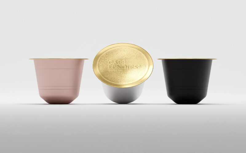
Café Lenoirs packaging uses colored craft paper with clean, cartridge-style text boxes. Black, pink, white, and gold indicate coffee intensity, reflecting organic, fair trade values in a minimalist, sophisticated design. The packaging for...
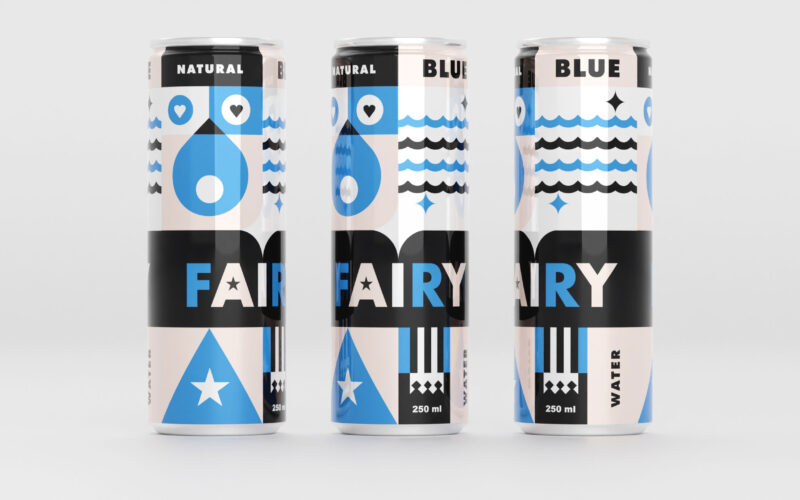
Blue Fairy’s 33cl can features gentle blues and pale pinks with geometric, childlike shapes evoking water, stars, and hearts. The design radiates calm, magic, and youthful whimsy for a soothing experience. The 33cl aluminum can for "Blue...